Infographic Wedding Details
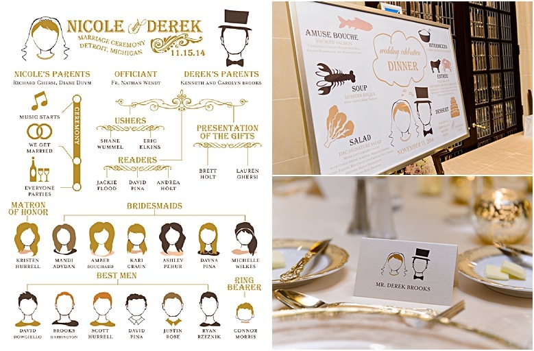
When looking back on weddings I have designed, this wedding stands out as the most personalized and custom. Nicole and Derek loved the infographic look. When I designed their infographic invitations I knew we were going to be cheekier and more free with the graphics. Nicole wanted the invitations to be more formal. So even though the invitations were custom and formal, I was able to take the design details and meld them into this extremely customized wedding.
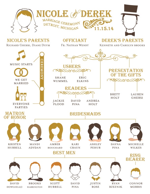
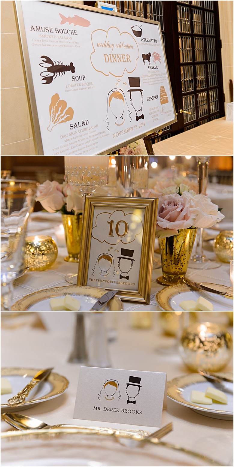
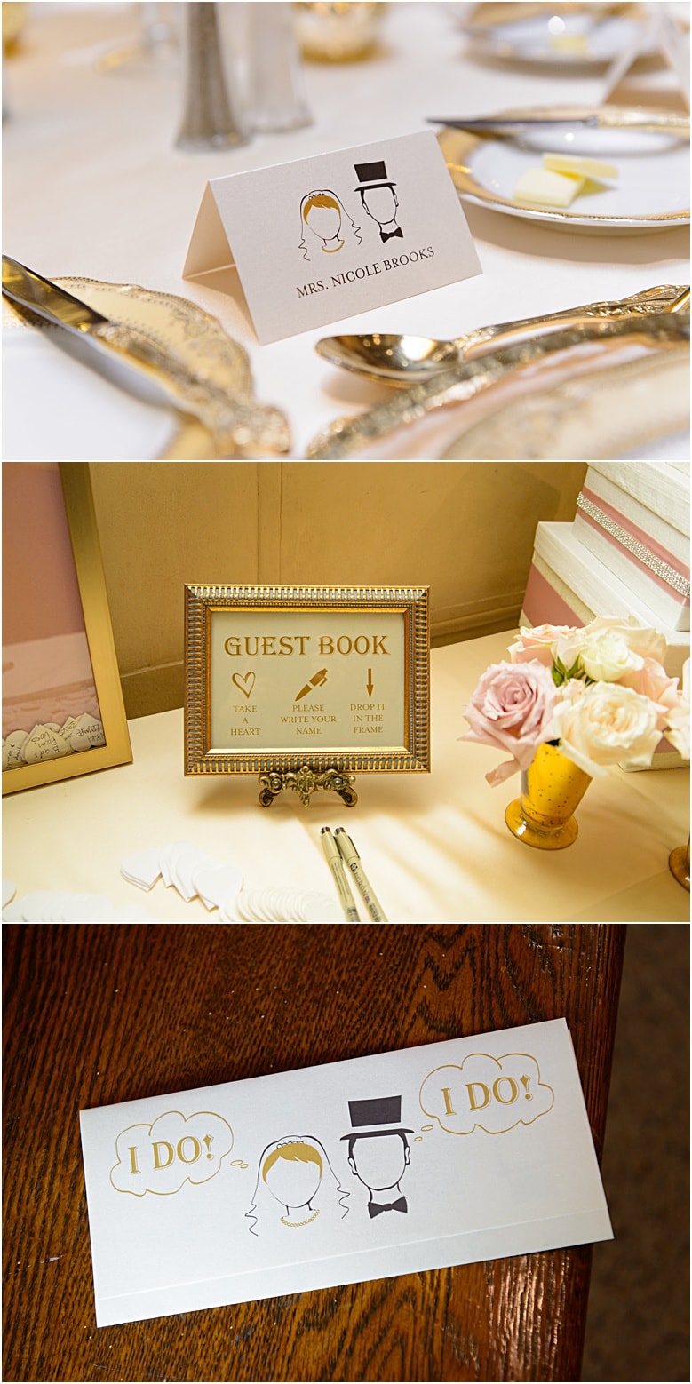
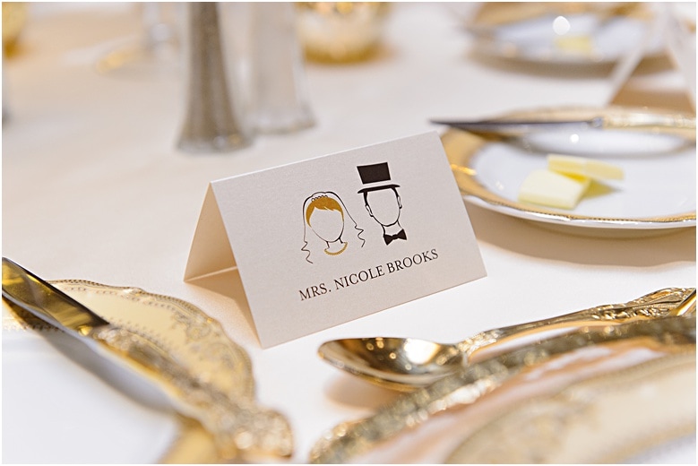
If you follow my blog, you might remember this infographic program published on mywedding.com. Nicole and Derek sent me photos of every bridal party member. I created silhouettes of every person and arranged them on their program in the flow chart style. At the wedding, each bridal party member had a place card with their silhouette! Their infographic menu has the bride and groom’s silhouettes with icons for each course. I thought it was super cute to have a “thinking bubble” over the silhouettes showing the dinner title.
I love creating personal items for our couples! Contact me today
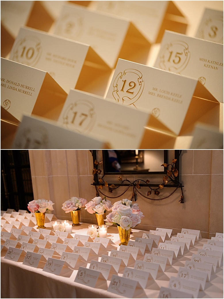
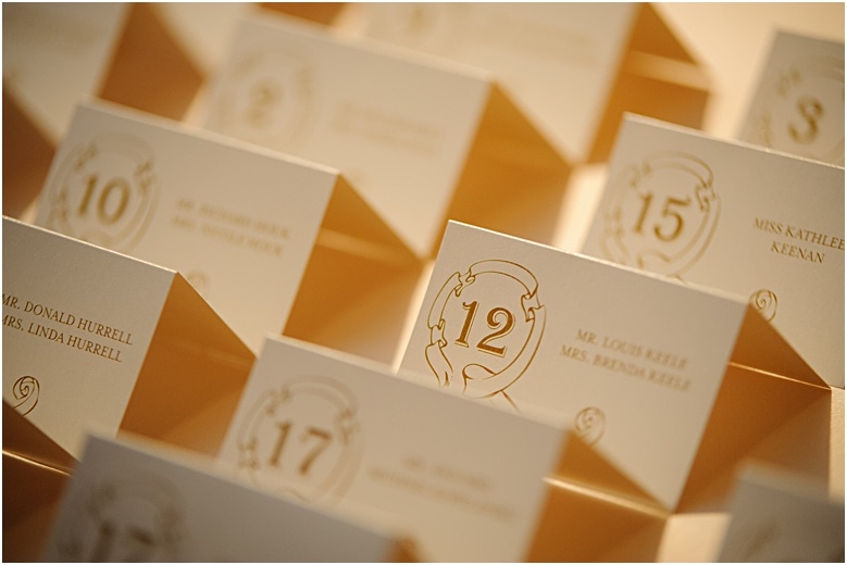 Where the bridal party had place cards with their silhouettes, the guest’s had escort cards. The graphic on the escort card came right from the invitation and the table number is loud and proud inside the ribbon circle.
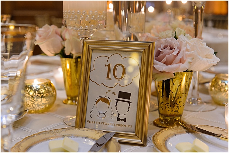 The thinking bubble from the menu started another theme through the infographic wedding details. Each table number had the bride and groom “thinking” table numbers! Custom drink signs had the bride on the left thinking her drink, with the groom in another frame on the right thinking his drink. It’s so adorable I can hardly stand it!
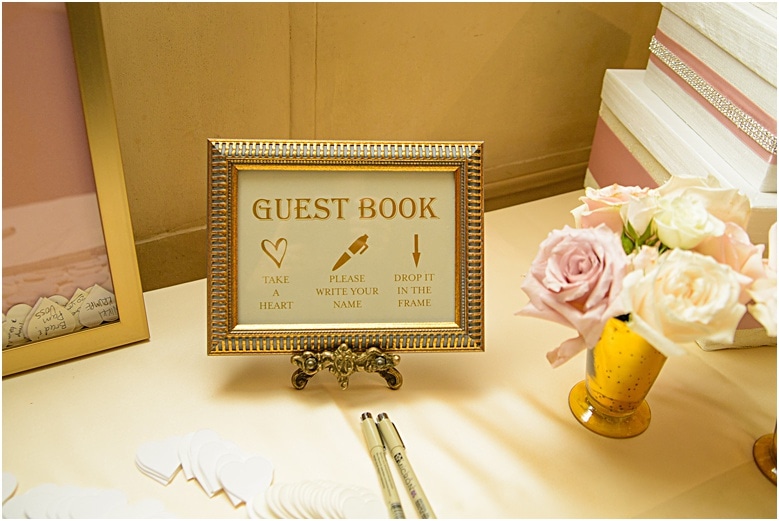
The guest book was fun and different too! Wood heart silhouettes are left out on the table for the guest’s to write a note and then drop into a shadow box frame. The guest book sign is also an infographic with the directions to take a heart, write your name, and drop it in the frame.

