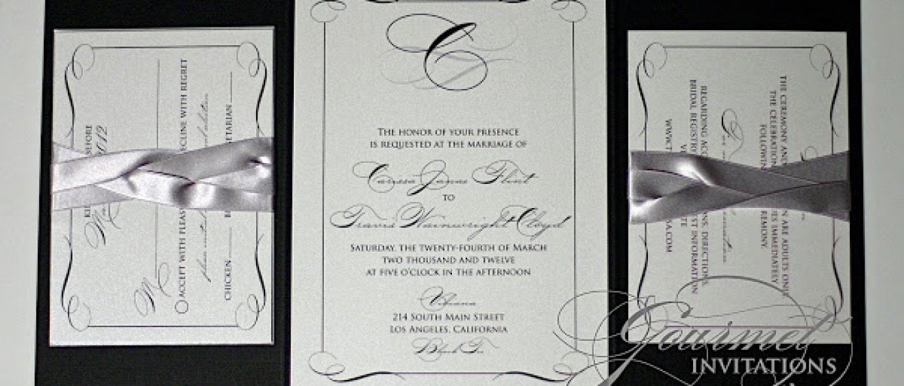
Carissa’s black and silver invitations were so elegant with the swirls, ribbon holders and custom design on the outer envelopes.
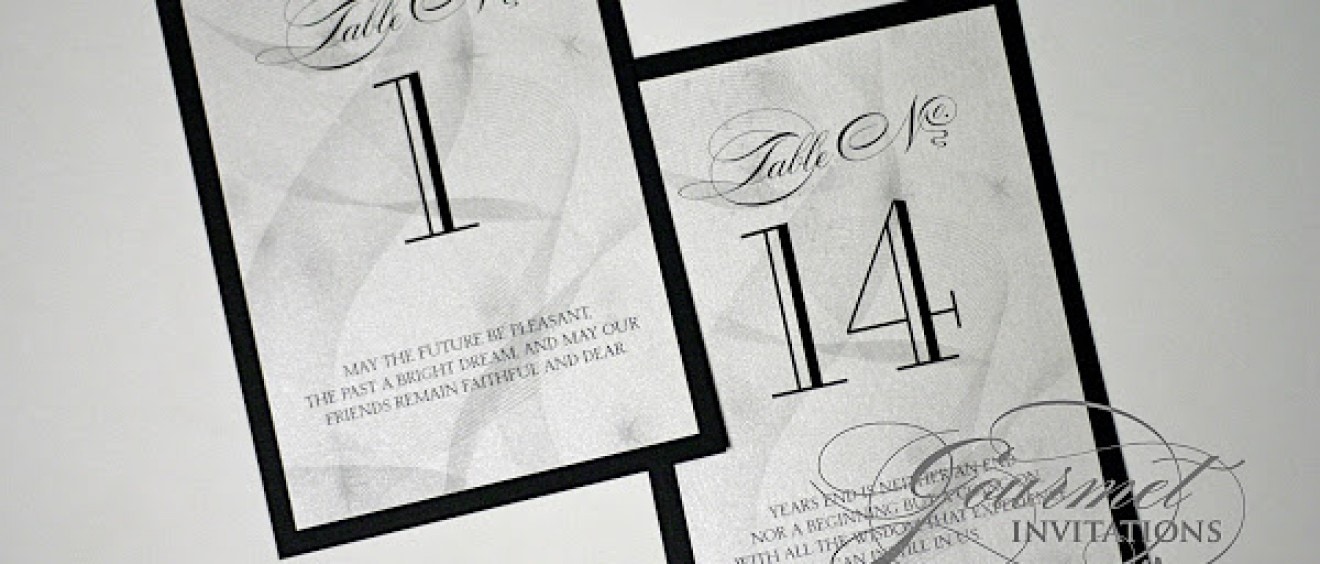
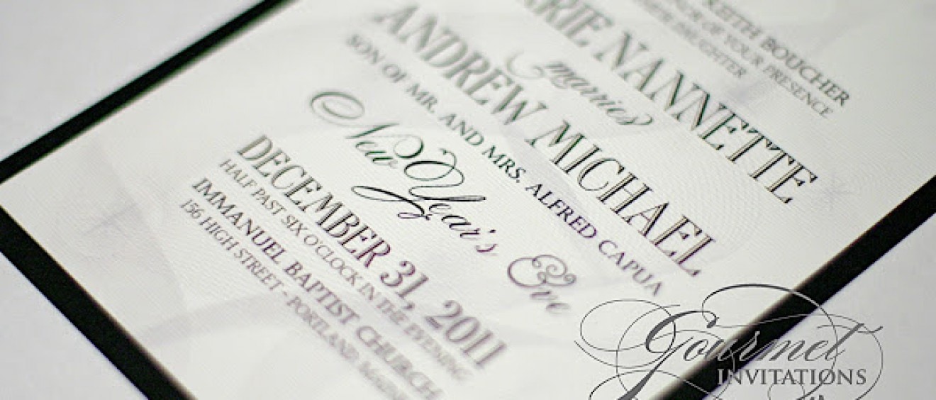
New Year’s Eve weddings are my most popular of the year and like most of my brides, Carrie wanted the theme of the invitations to carry on to the wedding. I designed do not disturb door hangers, table numbers with new year’s resolutions, schedule and gift bag tags.
Carrie wanted her New Year’s Eve wedding invitations to be very formal with a touch of celebration. I designed this suite with a falling streamer graphic that was just the subtle touch this suite needed.
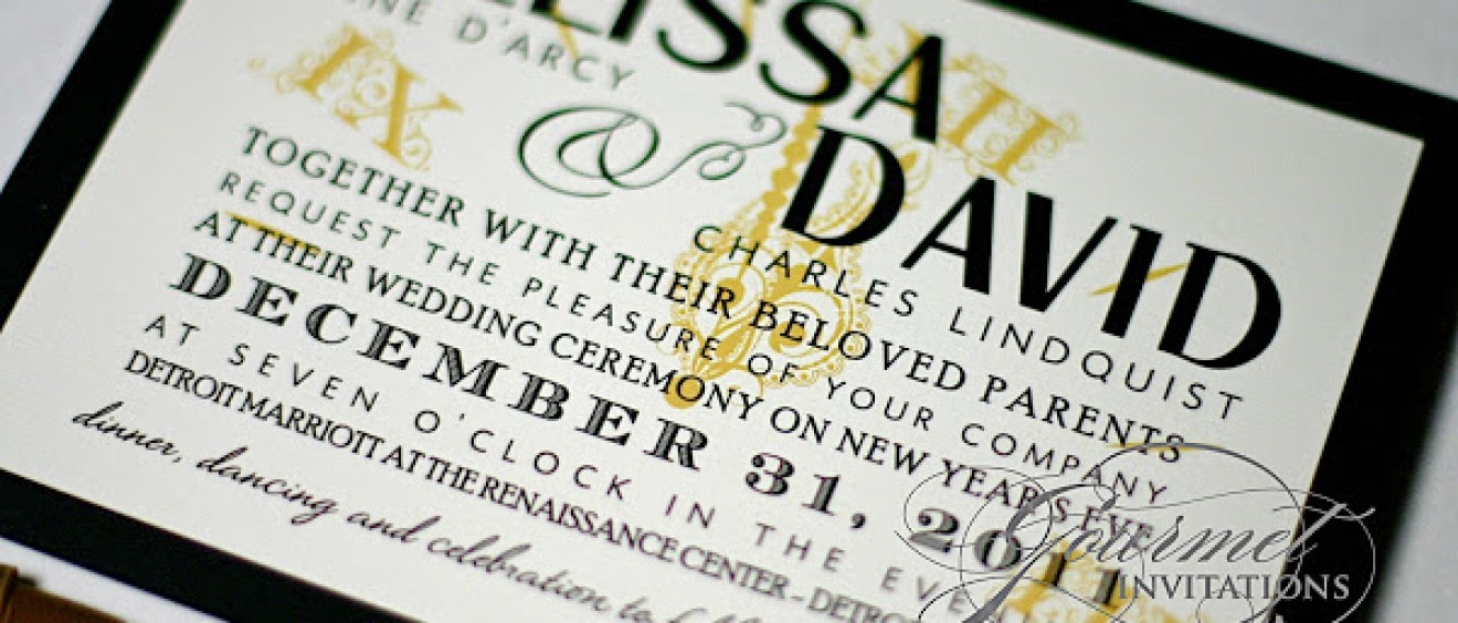
Melissa also fell in love with Kathryn’s invitation but I really encouraged her to let me try and design something more specific to their new year’s eve wedding. I just love this suite with the thermography printing and vintage framing and monogram.
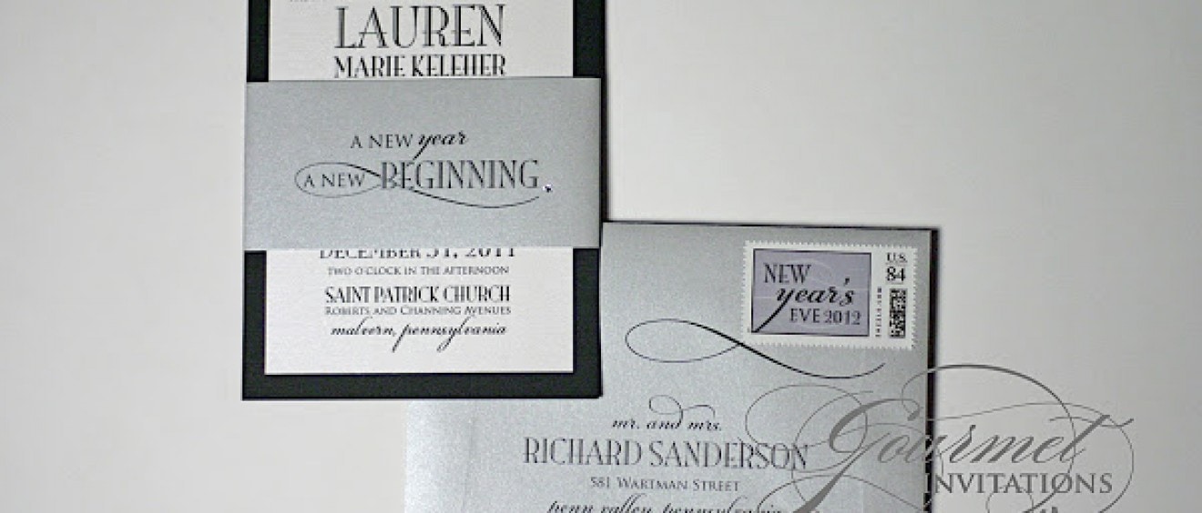
Lauren, like many of my New Year’s eve wedding brides, fell in love with Kathryn’s New Year’s eve invitations and wanted something similar. Although, designed after a past invitation, this invitation suite took on a whole new look with the addition of a sash and Swarovski crystal.
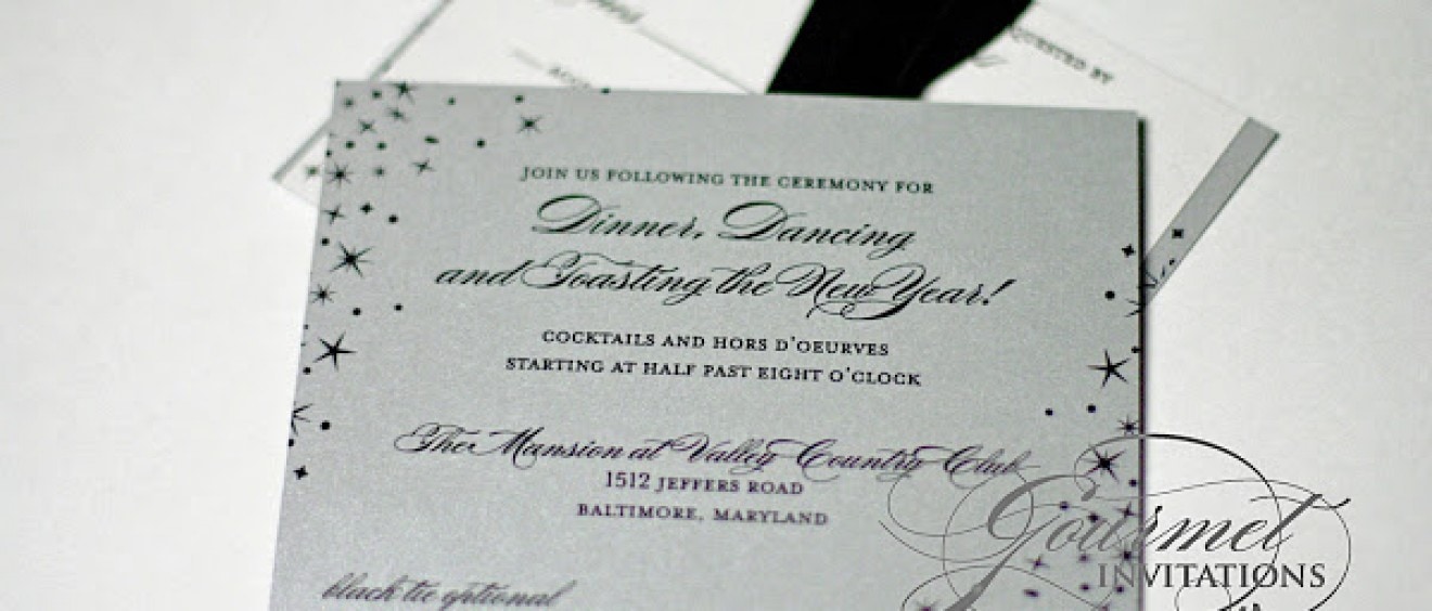
Abbie wanted a very festive feel for her wedding invitations, but still wanted them to be formal. I designed her wedding invitations with a star confetti graphic to accent all of her pieces.
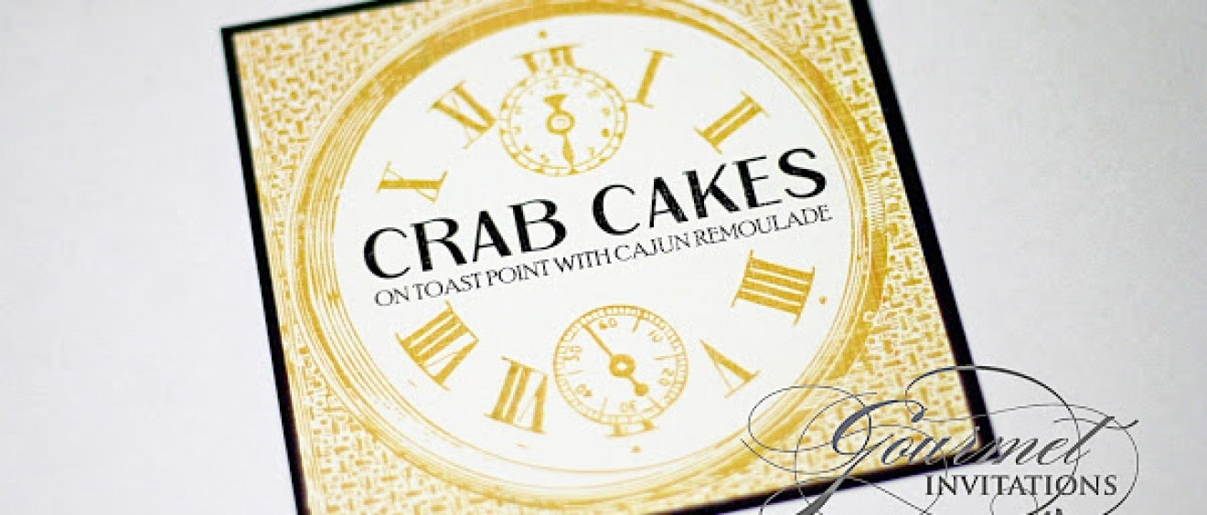
I had so much fun designing Melissa’s reception pieces. The clock theme was evident in all of the pieces, including the table numbers that were each a different hour and their monogram inside a pocket watch.
Melissa finally did a theme for her New Year’s Eve wedding that I have wanted to do for years – a clock theme! I used a different clock on each of her pieces, even on the custom postage.
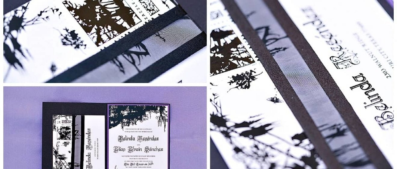
Enchanted forest wedding invitations are perfect for many locations. Belinda had fallen in love with my Tim Burton inspired wedding invitations. Her wedding took place at The Bell Tower on 34th in Texas and the enchanted forest weddings invitations were a great introduction to the theme of the wedding. Forest green folded cards were wrapped […]
Jenny’s wedding was very formal in black and white, but also very contemporary with the fonts and stripes. I designed the placecards with three different stripe patterns to designate each guest’s meal choice.

