Beth + Douglas: Vintage Style Gatefolds
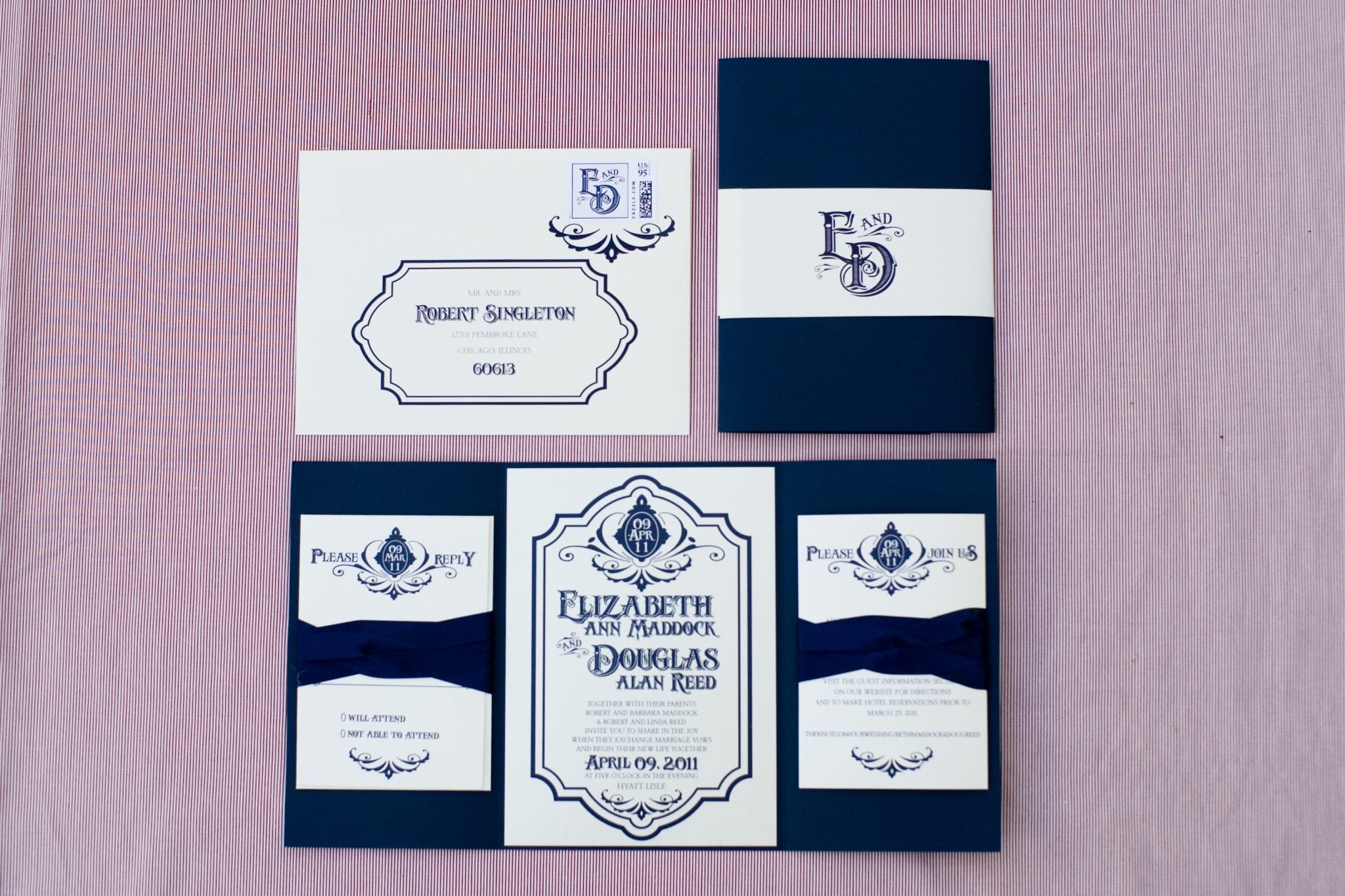 Vintage is one of my top favorite styles. Beth’s pretty colors of deep navy and ivory were gorgeous on this vintage style gatefold invitation. All images in this post are credited to Kristen Taylor Photography!
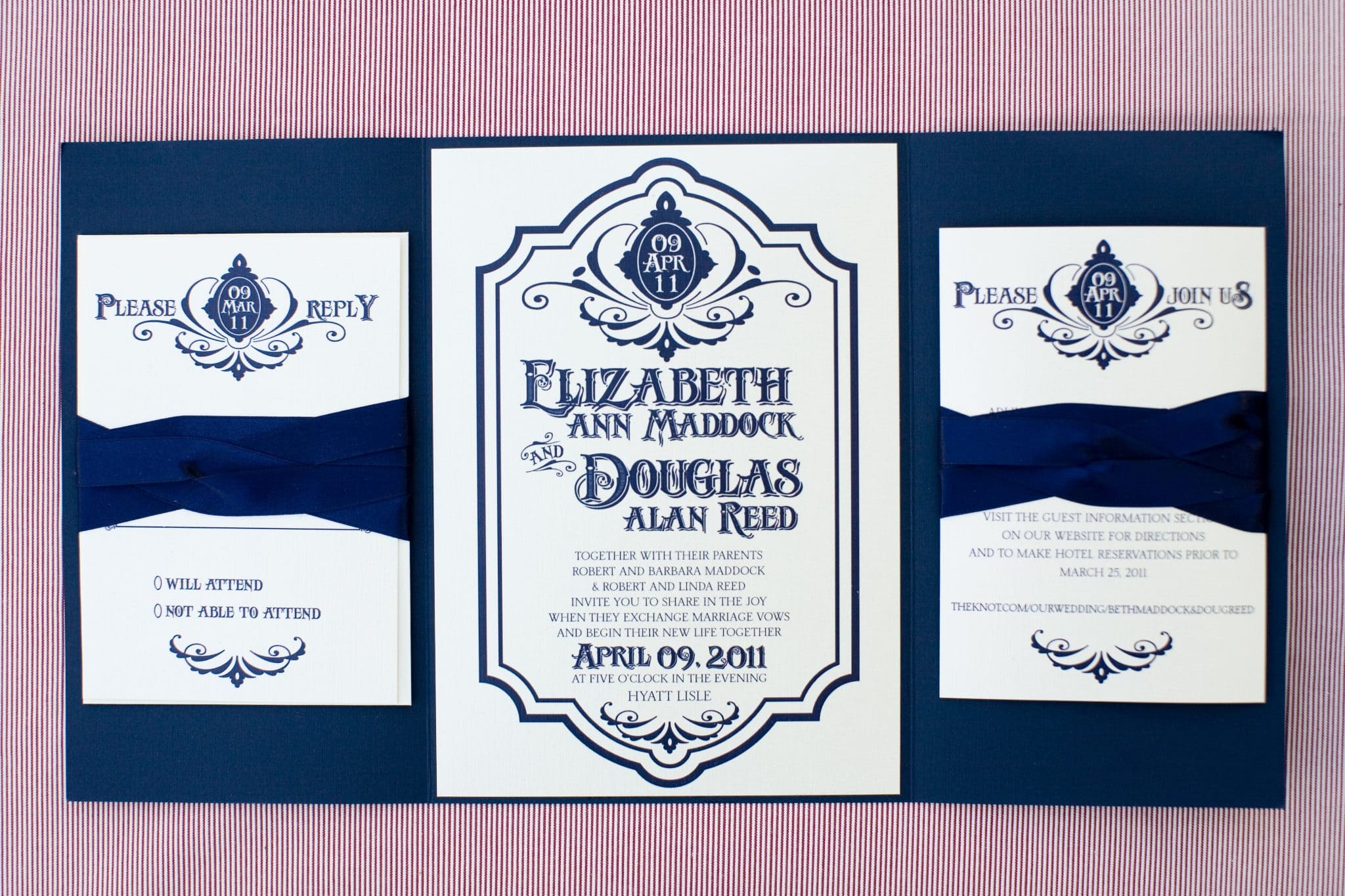 Elizabeth’s gatefold invitation was designed to look like a vintage sign with a large border, date logo and one of my favorite vintage fonts to highlight their names.
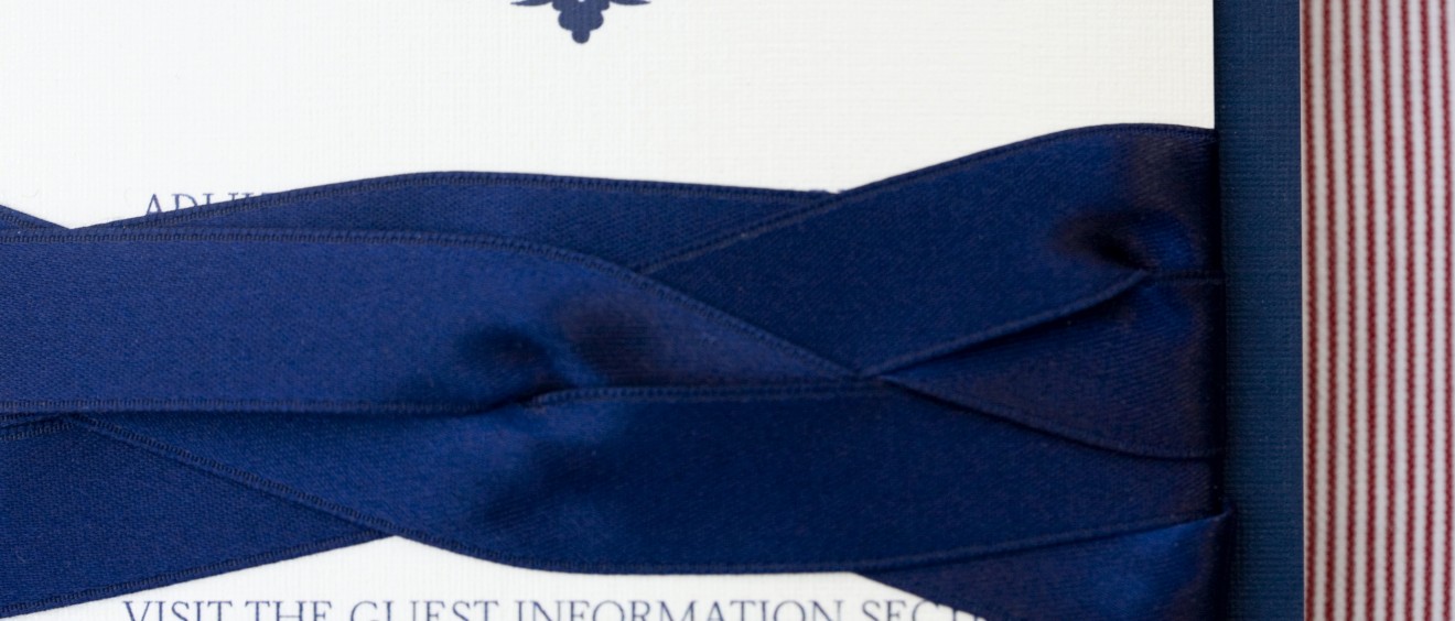
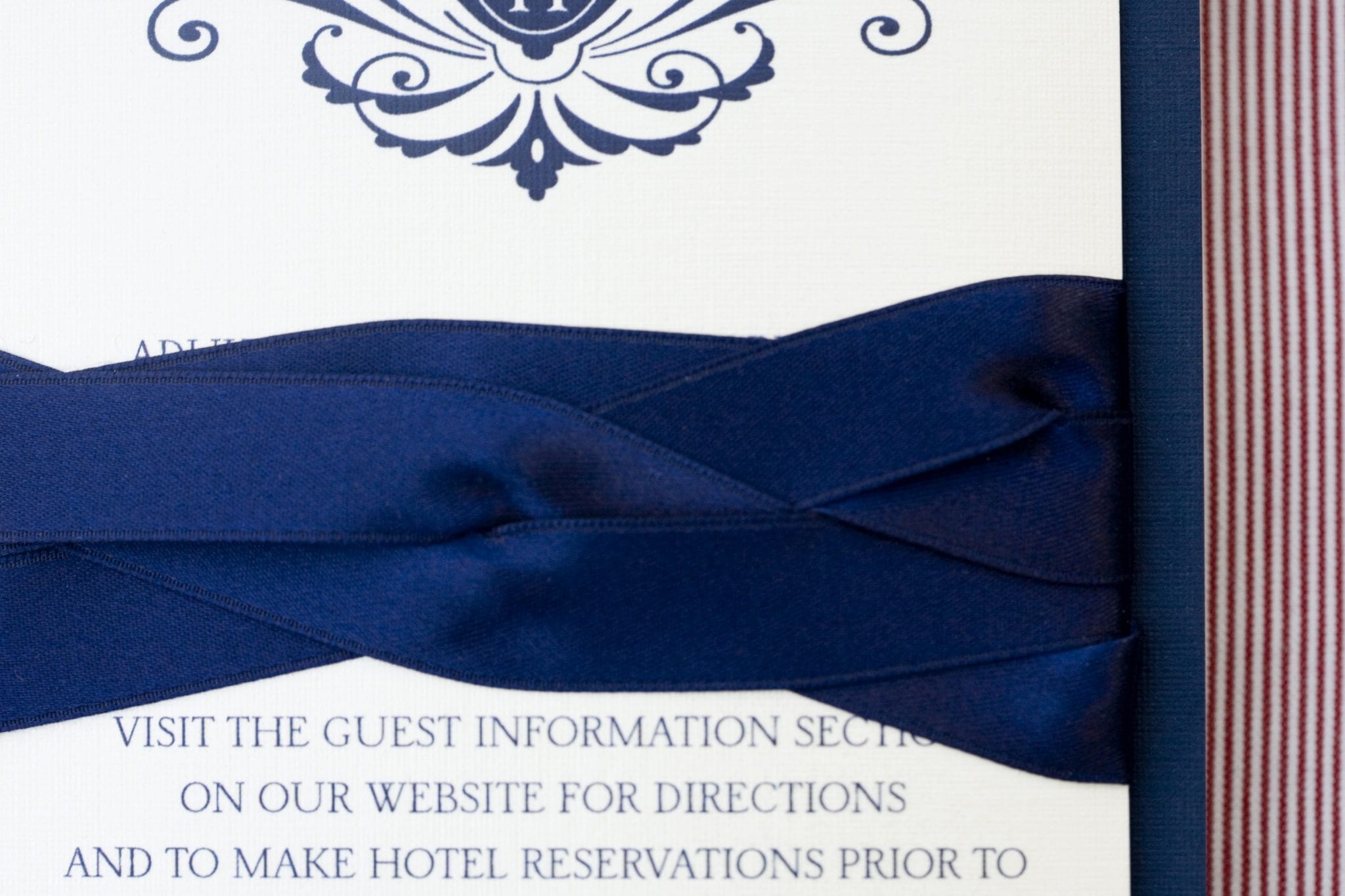 The inserts were held into the gates of the invitation with lots of twisted navy ribbon. The headers of each of the inserts were fun plays on the date logo from the invitation.
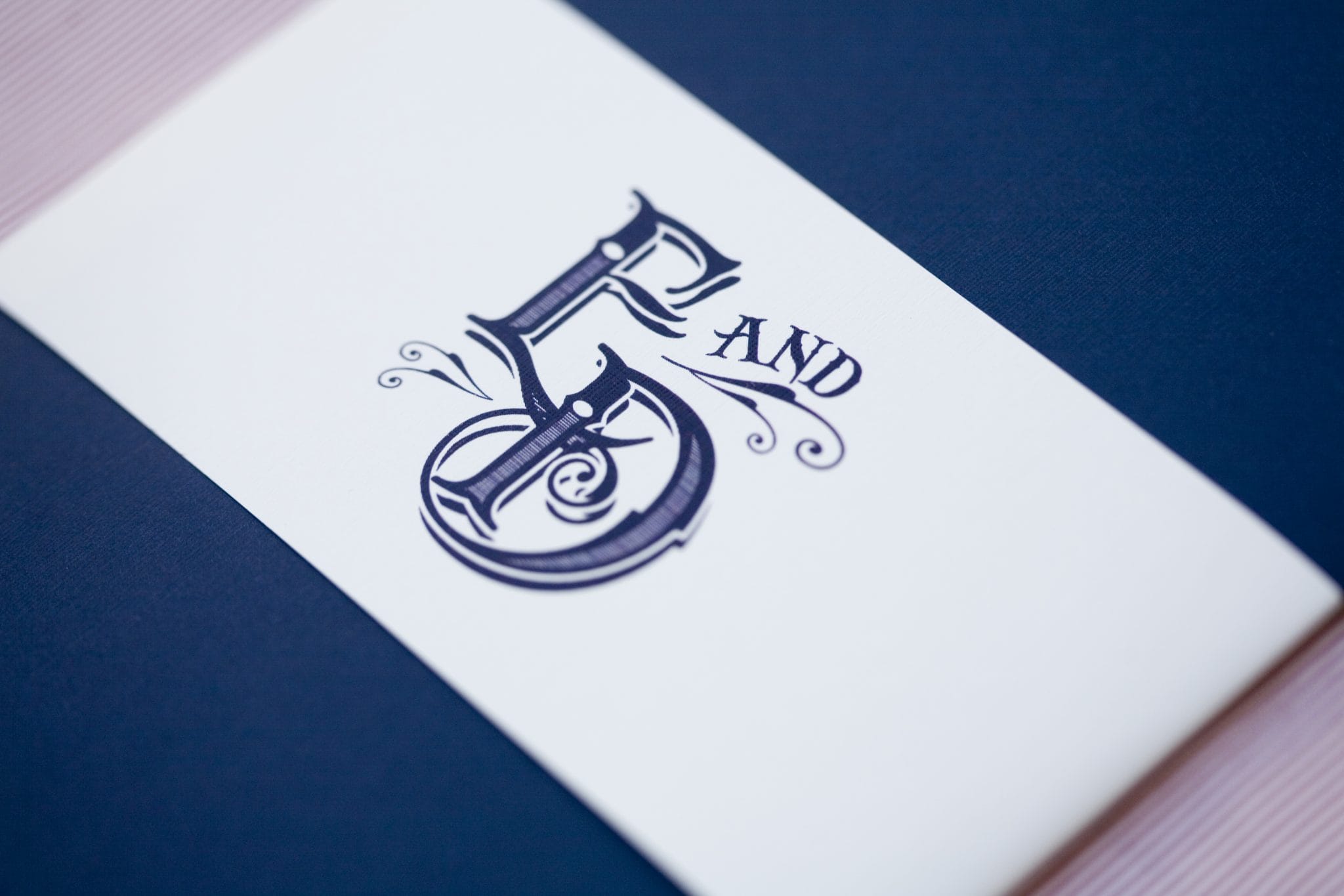 The gatefolds were held shut with a custom paper sash with their monogram.
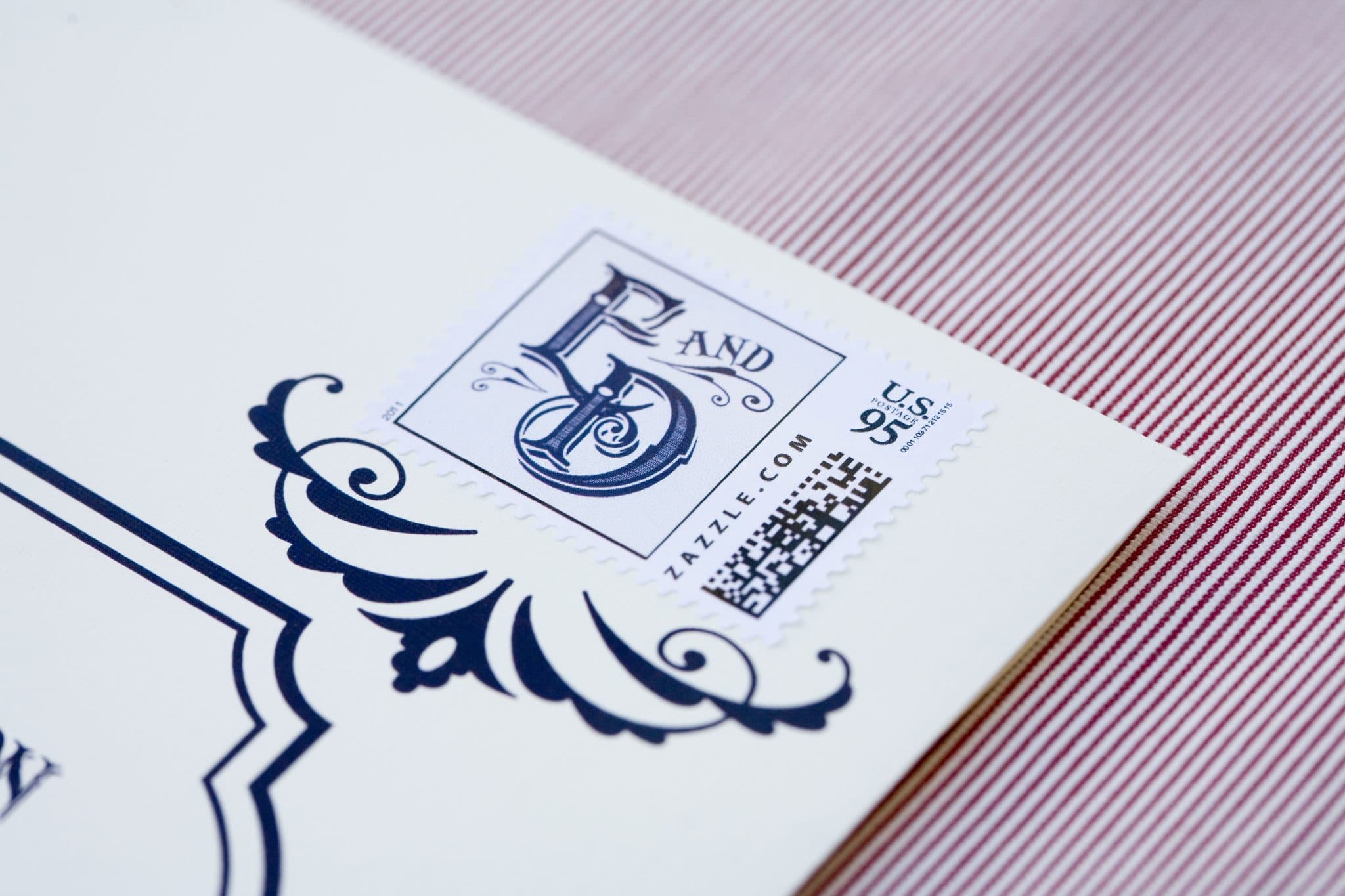 The outer envelopes were custom printed with elements from the invitation and the design was accented with matching custom stamps.
All of Beth’s reception decor will be posted tomorrow!

I’m an artist and I would love to use this font in some of my art. Would you mind sharing the name of the font? I love vintage fonts and this one is beautiful!