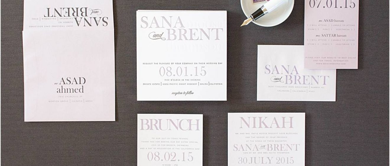
Typography Letterpress Invitations These typography letterpress invitations have three colors on the invitations! They are printed with lavender, slate grey, and also no color – or blind debossed. The typography (the layout and use of fonts) is so much fun. The first names are in all caps and that layout became the monogram for their […]
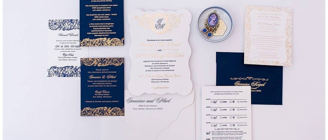
Letterpress and foil stamping are stunning on their own. But combine them together and you get . . .WOW! Both print process create a depress in the materials since they are pressed into the medium that you are printing. In general, letterpress would create a deeper depression than foil stamping. Letterpress tends to be a […]
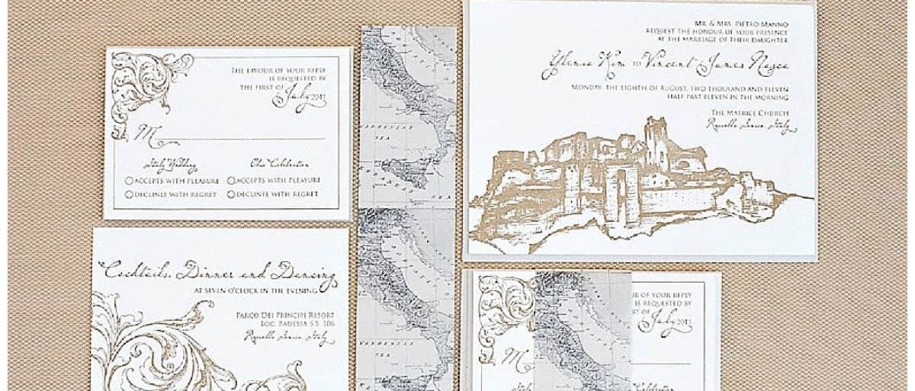
These edge painted letterpress invitations were designed with a sketch of the castle in Roccella Ionica, Italy where the wedding was taking place. Ylenia’s Italy Destination wedding invitations were accented with an antique map of Italy wrapped around the inserts as a belly band. The edge painted letterpress invitations were printed with gold ink. Edge […]
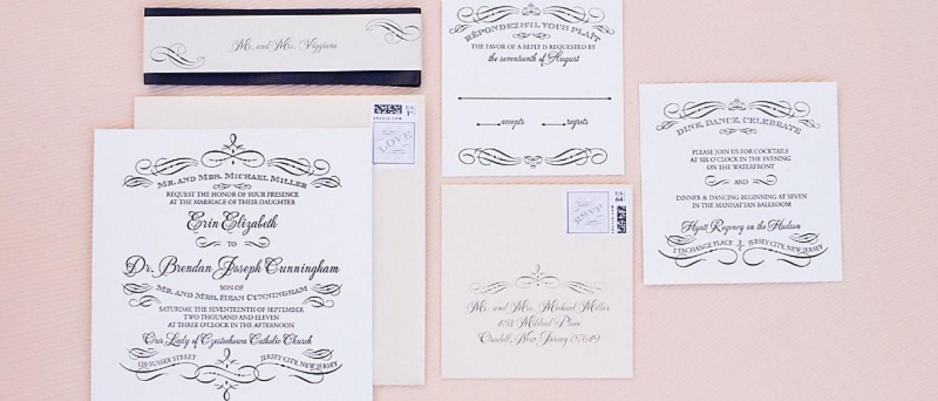
Erin’s vintage styled wedding reception followed the same look and feel as the wedding invitations. Programs, menus, table numbers and placecards are added special details to the reception.
Erin’s vintage style invitations were a first for me – an oversize square letterpress with all square inserts. The charcoal grey and blush pink accents were the perfect colors for this vintage frame invitation. Images by Kristen Taylor Photography.
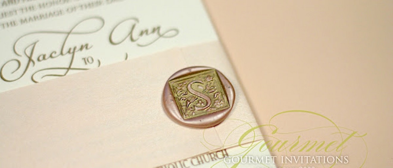
Jaclyn’s wedding invitations are simply stunning with so many details. The invitations are printed with a metallic gold letterpress ink. There is a beautiful addition of gold foil printed in the lower corner highlighting their names. The invitations were designed to create a very personal motif. There is an apple for the “big apple” where […]
This invitation suite combined two of my favorite design features – letterpress and my custom gatefolds. Arielle loved the vintage look of letterpress and we combined it with cream, gold and lots of burgundy. The invitation is designed with vintage scrolls and printed in a matching burgundy ink. The outside of the gatefold was held […]
Leslie has such a fun color scheme for her wedding, bright yellow, butter yellow and sky blue! I designed these letterpress invitations on gorgeous butter yellow stock with blue ink. Blue Hydrangea will be abundant at the wedding and Leslie wanted to highlight the hydrangea on the invitation. The insert alternated in the butter yellow […]
Kelly’s invitations were inspired from the gorgeous flowers on her Amsale Wedding gown. Kelly’s wedding colors are pale butter yellow, steel grey and navy. The invites were designed on butter yellow letterpress and the flowers were pressed with no ink. The inserts were bound together with lots of twisting navy blue ribbon. The yellow letterpress […]
Soti contacted me to design her letterpress invitations and knew she wanted something formal and elegant. Her colors are a rust-copper color and brown and the combination made for a stunning fall letterpress set. I designed a scroll ornament with a border of dots. I just love the impressions that dots and curls make into […]

